![](https://cdn.myportfolio.com/8664c4d4-85ec-4bd3-a5a8-8525ce61c669/f6e1cb4f-59b1-4861-adb2-ad657e2d55c2_rw_1920.png?h=f87f256bb76796aca2bd42998fccbbdf)
![](https://cdn.myportfolio.com/8664c4d4-85ec-4bd3-a5a8-8525ce61c669/86ed2aa6-92e7-4c68-8177-93a1c47b9765_rw_3840.jpg?h=7eee71e2d05f50fc003dcffc5d78414d)
![](https://cdn.myportfolio.com/8664c4d4-85ec-4bd3-a5a8-8525ce61c669/cb40a4a6-a4f3-484a-840f-6767b44622b8_rw_3840.jpg?h=aa16c1749092dff949774d283f1225d6)
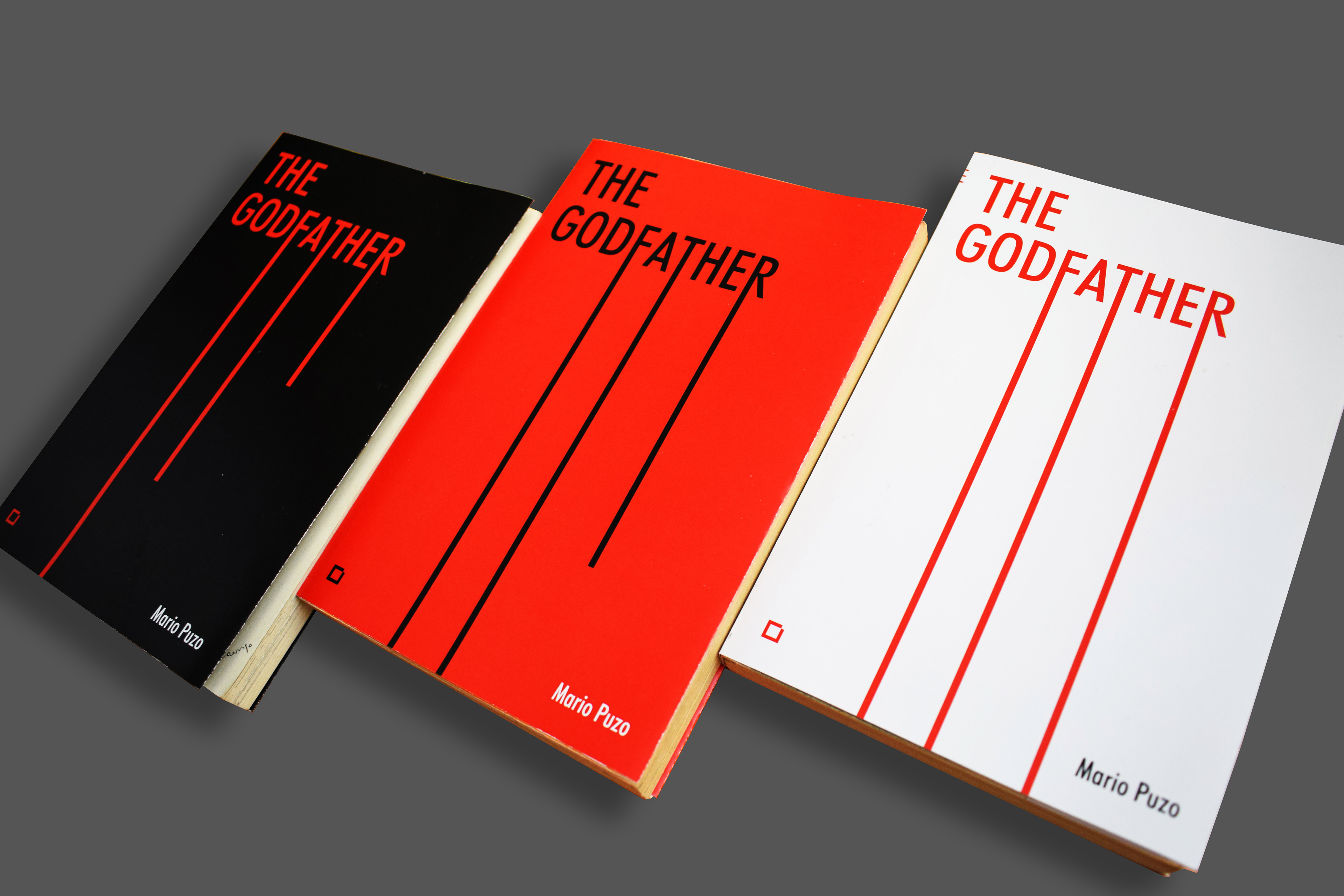
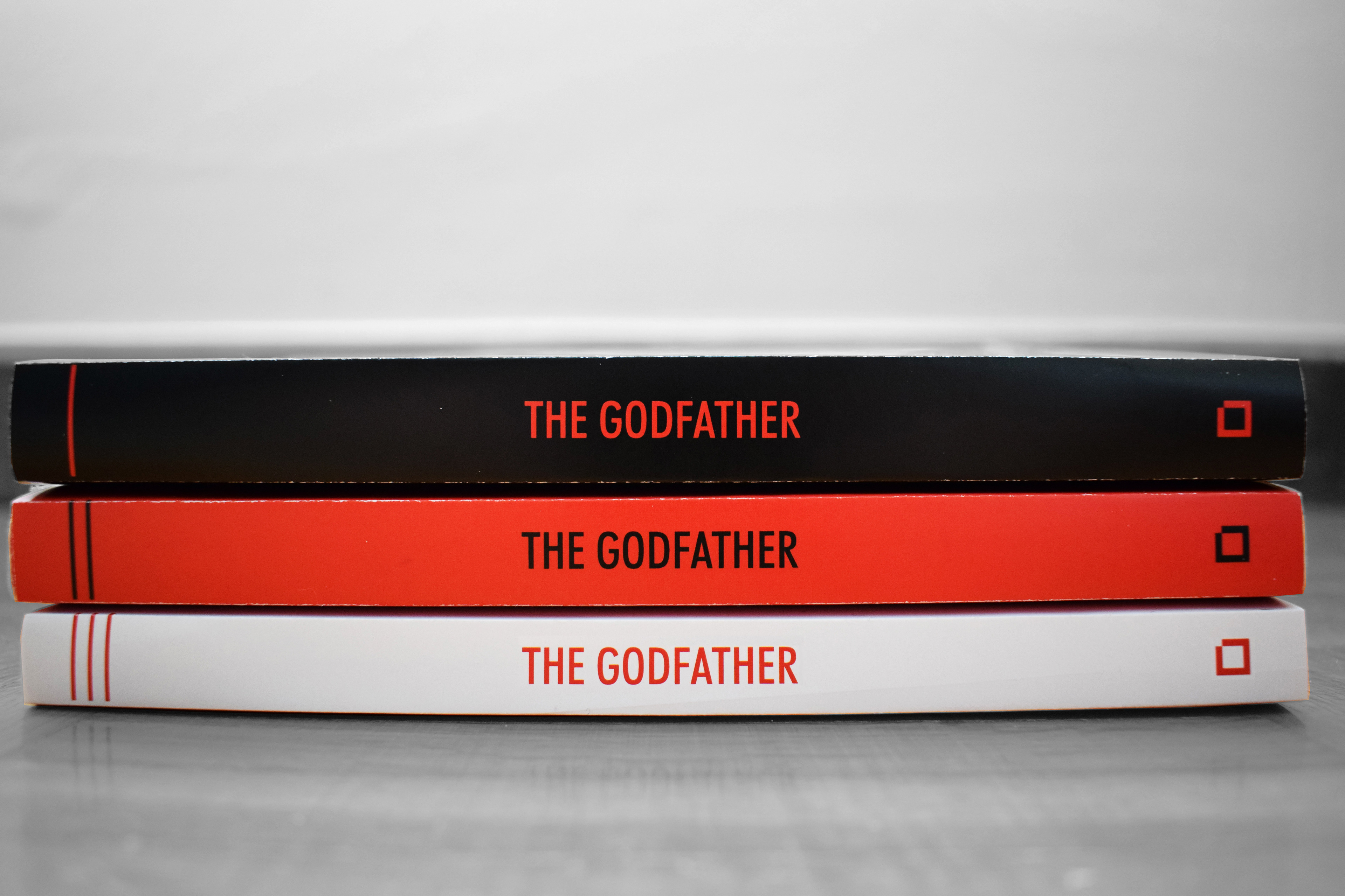
I chose to work on the book covers for one of my all-time favorite trilogies: Mario Puzo's The Godfather, using the following keywords: unity, contrast, continuity, typography, and synthesis. I looked for ways to treat both typography and color in a way that would communicate the idea of trilogy and continuity, while always having the synthesis of these concepts in mind.